(20)
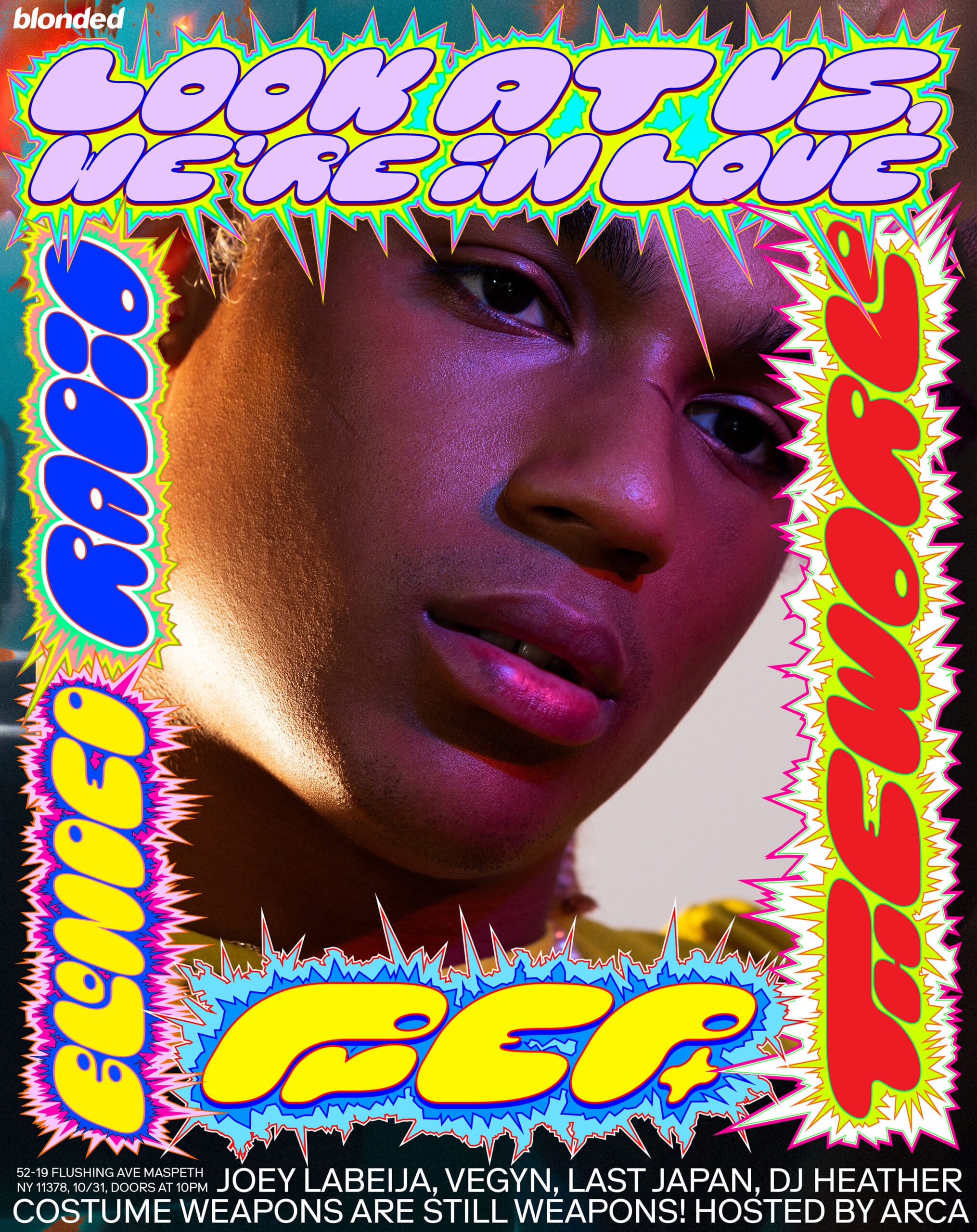
Like this one he did for Frank Ocean. Photography by Michael Marcelle

(21)
Read an interview about that collaboration on AIGA Eye on Design

(22)
Julian Bittner provides an excellent reference PDF here
(23)
63 words from M/M:
An image never interests us as such. Its relevance lies in the fact that it contains the sum of preceding dialogues, stories, experiences with various interlocutors, and the fact that it induces a questioning of these preexisting values. This it what makes for us a pertinent image. A good image should be in between two others, a previous one and another to come
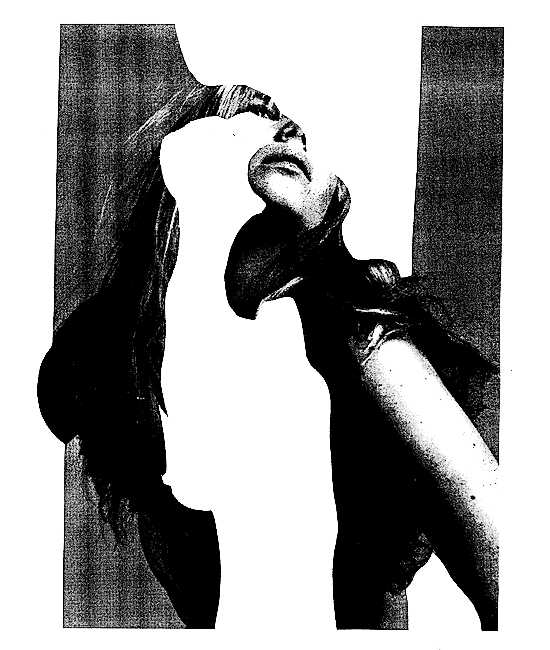
N (here for Nejc, but otherwise for Nicola) taken from “Alphabet” 2001 by M/M Paris

(24)
Inspired by the progression of post-war contemporary art and his father’s experience of working in the car manufacturing industry, Paul Elliman first developed his Found Font in the 1980s. This visual language, created from gathering letter-like objects and debris, has been used by Elliman with designers Sara de Bondt and Mark El-khatib to create the visual identity for Liverpool Biennial 2018.
What’s in Your Pocket?
–with Nejc Prah
Words by Madeleine Morley
with Nejc Prah, sponsored by Glyphs
Stockholm, 24-25 March 2022

What’s in your pocket? Empty it all out on the table. Throw down whatever’s in your dress, your hoody, your jacket, or your trousers. Maybe you’ll find some bubble gum. Or maybe you’ll find a pair of keys, a phone, or some scrunched up receipts. For others, it might be lip gloss, a tampon, or an apple. Whatever you find, lay it out in front of you. And now, use whatever you have to build a typeface.
This is the brief first year visual communication students at Beckmans College of Design received from Nejc Prah while participating in the Post Design Tangle’s workshop over two days in Stockholm, March 2022. Nejc himself is known for energetic poster designs that twist and turn with bulbous, tactile alphabets: He’s produced tangly work for Bloomberg Businessweek, Frank Ocean, Boiler Room, and many more. For the Slovenian designer and educator: “If you can make something in just two days from what you find in your pockets, then you can make a typeface for a poster.”

Students were asked to use one, or two, found objects to create their alphabet. And final typefaces didn’t necessarily need to reveal the original form of the object, either. “The found object is simply a tool,” said Nejc. “Its actual function is irrelevant.” Students were asked to consider the system binding their typeface together, while not worrying about legibility, coherency, or perfection.
Some students created typefaces from cables and keys—others a banana peel, a single thread, and rolling tobacco. Feeding into the overarching theme of the Post Design Tangle, “Entangled Practice,” the workshop revealed how the practice of type design itself—so often perceived as laborious and rule-driven—can actually be something spontaneous, fast, and playful. “What’s important for this is that you ignore the traditional rules of font making,” said Nejc.

While commissioned bespoke typefaces or headline fonts often adorn posters created by graphic designers, Nejc wanted to show students that they can quickly and cheaply create their own custom fonts for projects. The hand cut, drawn, and stenciled typefaces of M/M Paris are one example he presented of less rule-driven approaches to illustrative type—as are the found fonts of Paul Elliman.
Bottle openers, combs, rings, hair ties, a Swiss Army knife, and a week old sesame cookie were other objects dredged from student pockets and transformed into the 29 letters of the Swedish alphabet. Students imported scans and photographs of their pocket finds onto their screens, using vector based softwares to trace, redrawn, and rearrange.
To tie the workshop together, one letter from each of the 16 participating students was placed in the first floor window of Beckmans College of Design—spreading its resounding message to passer-byers on the streets of Stockholm. If you can manage to read the typographic scramble, the 16 letters spell out “Annonsblockerare”—meaning “Ad blocker” in Swedish. Why? Who knows. Sometimes it’s best not to overthink too much.


