Ana Elena Chiță is a graphic designer based in Bucharest, driven by editorial design, archival research, and Romanian visual culture. Her practice is shaped by an interest in how culture is preserved through images, typography, and printed matter. She currently works at Policromic Studio, where she contributes to cultural projects ranging from exhibition design to visual identities and printed publications. She is also part of the Local Design Circle team, an association dedicated to supporting the Romanian graphic design community, promoting visual education, and creating contexts for dialogue between designers and the public.
Echoes of Influence: A Personal Essay on Romanian Visual Heritage
After years of studying graphic design, I was able to name movements and designers across Europe, but not in my home country, Romania.
I was taught to trace narratives from around the world and especially the Netherlands where I studied. It was easy to learn their national history through named movements, leading designers, and clearly defined visual identities, from the country’s railway logo to decades-old banknote designs. Yet, when I looked for an equivalent in Romania, I realised I could not point to anything resembling a visual language, a famous movement, or even a single widely recognised graphic designer. I began to wonder whether this was a real absence or simply a gap in my personal understanding. What began as my thesis research536 turned that uncertainty into a guiding question: How did Romanian visual language evolve in the 20th century, and how did we lose trace of it?
Researching this question comes with a certain pressure since almost nothing has been documented about Romanian (graphic) design history. This absence is not simply an oversight. It points to deeper structural failures in Romania’s archival system, from chronic underfunding and limited storage to understaffed institutions that lack the capacity to collect, catalogue, and preserve materials over time. Graphic design, too, has rarely been recognised as a field worthy of sustained study, and its artefacts were therefore rarely treated as cultural heritage in the first place.
I am neither a historian nor a professional researcher, and I approached the subject speculatively, drawing on personal and archival sources, conversations, family collections, and periodicals to reconstruct this visual history. In this essay, I use the term visual language or heritage to describe recurring graphic design elements, styles and systems that have survived across time in collective memory.
To bring these fragments to life, I draw on two main sources. Firstly, from a personal perspective: a conversation with my grandmother, Maria Chiță, a retired mathematics teacher born in 1948 in Caraula, a small village in southern Romania, on how design circulated in everyday life. Secondly, from a professional perspective: my interview with Raymond Bobar537, a Romanian graphic, editorial, type designer and essay writer, whose reflections on the development of Romanian visual language offered a design-centered understanding of its evolution and challenges.
My research looks at the period 1900 to 1989538, spanning both the pre-communist era and the decades of communist rule. I focus on popular periodical publications as a lens through which to read political history. Magazines have long functioned as vehicles for persuasion, projecting utopian futures for their readers, futures whose definitions and images shift with whoever holds power. That is precisely what makes them compelling artefacts to begin from. And because they were produced in such high volumes, they often persist in bookshelves and attics even when national archives and other records were lost or destroyed.
In order to research them, I needed to collect them. I started gathering issues from antiquarian bookshops, by asking around, and mostly from my grandparents. The process turned into a treasure hunt, each small quest accompanied by long conversations, which eventually resulted in my own small collection of publications. They became my means of understanding a time otherwise unfamilar to me. By examining the design decisions, from the use of decorative elements, colour palettes, illustrations, typographic choices and treatments, I drew a subjective map as a guide through the research process. I found myself studying these publications in the same way as described by Amanda-Li Kollberg and Siri Lee Lindskrog in Notes on Book Design:
“As book designers ourselves, we take note of design decisions made by others and try to understand their reasoning as situated in a certain time and place with its own contemporary circumstances, available technologies and cultural currents. The resulting texts are not book reviews, but observations wrapped in subjective and sometimes speculative reflections.”539
For Romanian culture, the pre-communist years of the early 20th century, beginning around 1910, mark a period of both tension and expansion: a slow negotiation of what Romanian cultural identity and visual expression wanted to become. This expansion was not territorial, but cultural, visible in the diversification of artistic and editorial practices and in a growing openness toward Western models. Romania positioned itself in the in-between, pulled between local traditions and external influences, especially those arriving from Western Europe.
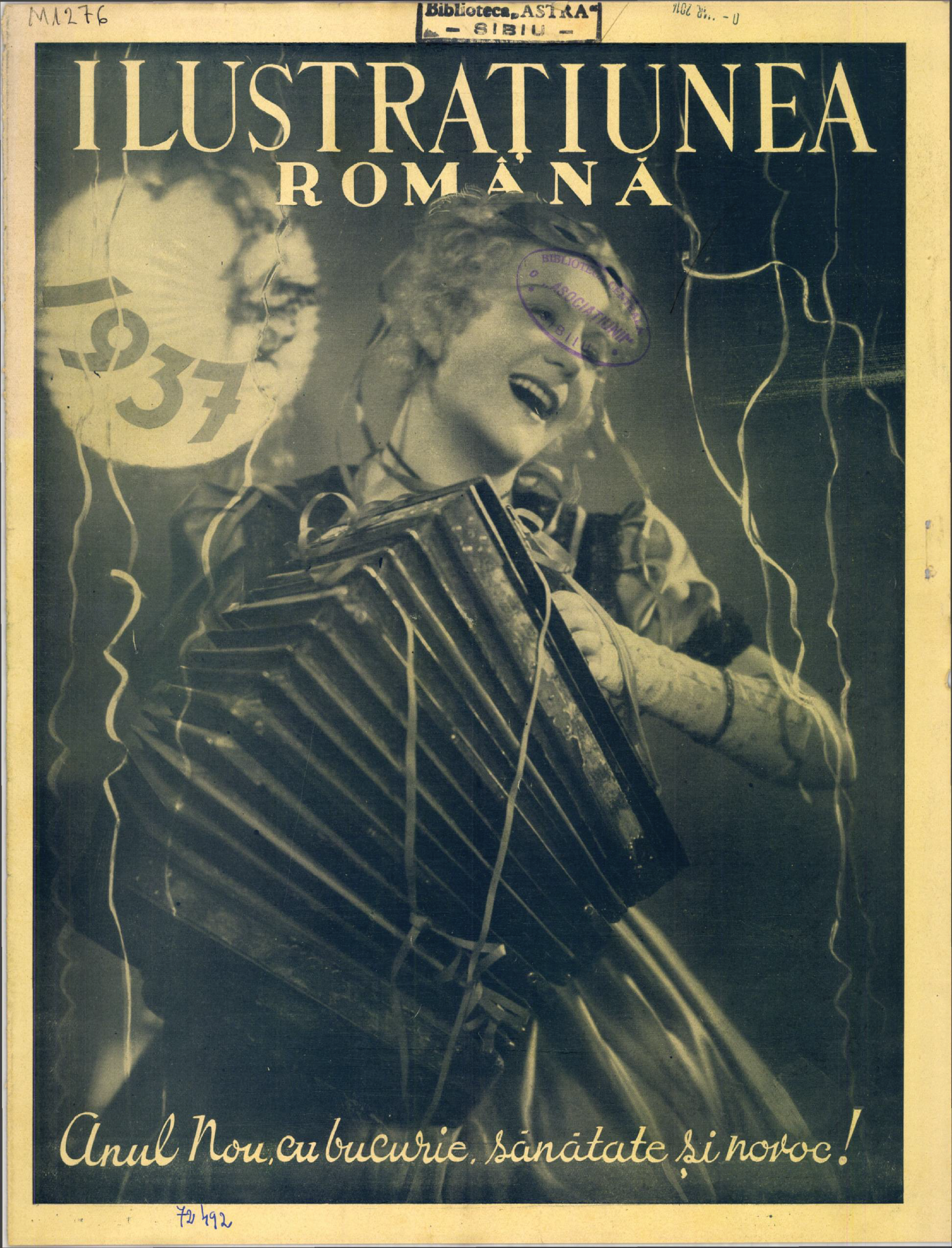
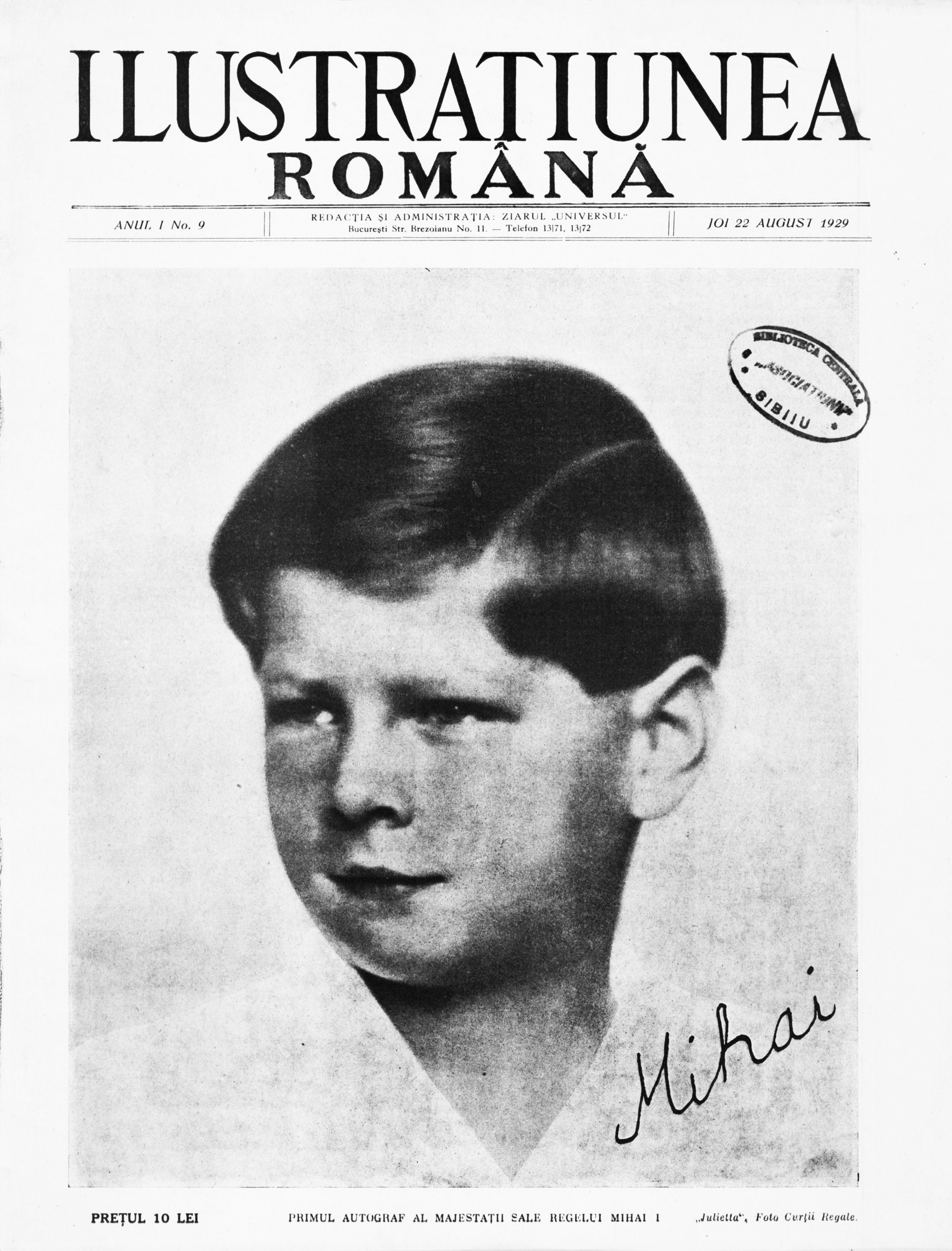
The absence of complete archives, poorly documented publications, missing issues, and inaccessible collections, combined with a general lack of information, reshaped the process into a personal reconstruction of the narrative. I first encountered the magazine Ilustrațiunea Română540 (Romanian Illustration) by chance in an antique shop in Cluj-Napoca. It was a title I had never heard of, and that accident became a lead: it sparked a growing interest and a series of attempts to locate further issues and related materials. In one early number, the introductory editorial message makes its desire for Western-style modernisation explicit:
"We present the first issue of "Romanian Illustration" with the belief that we are giving the general public what it has been waiting for a long long time and what it needs: an illustrated magazine in the broad and Western sense of the word, a magazine of photographic reportage and illustrated documentation that, despite all material difficulties, can be within the reach of the general public…".541
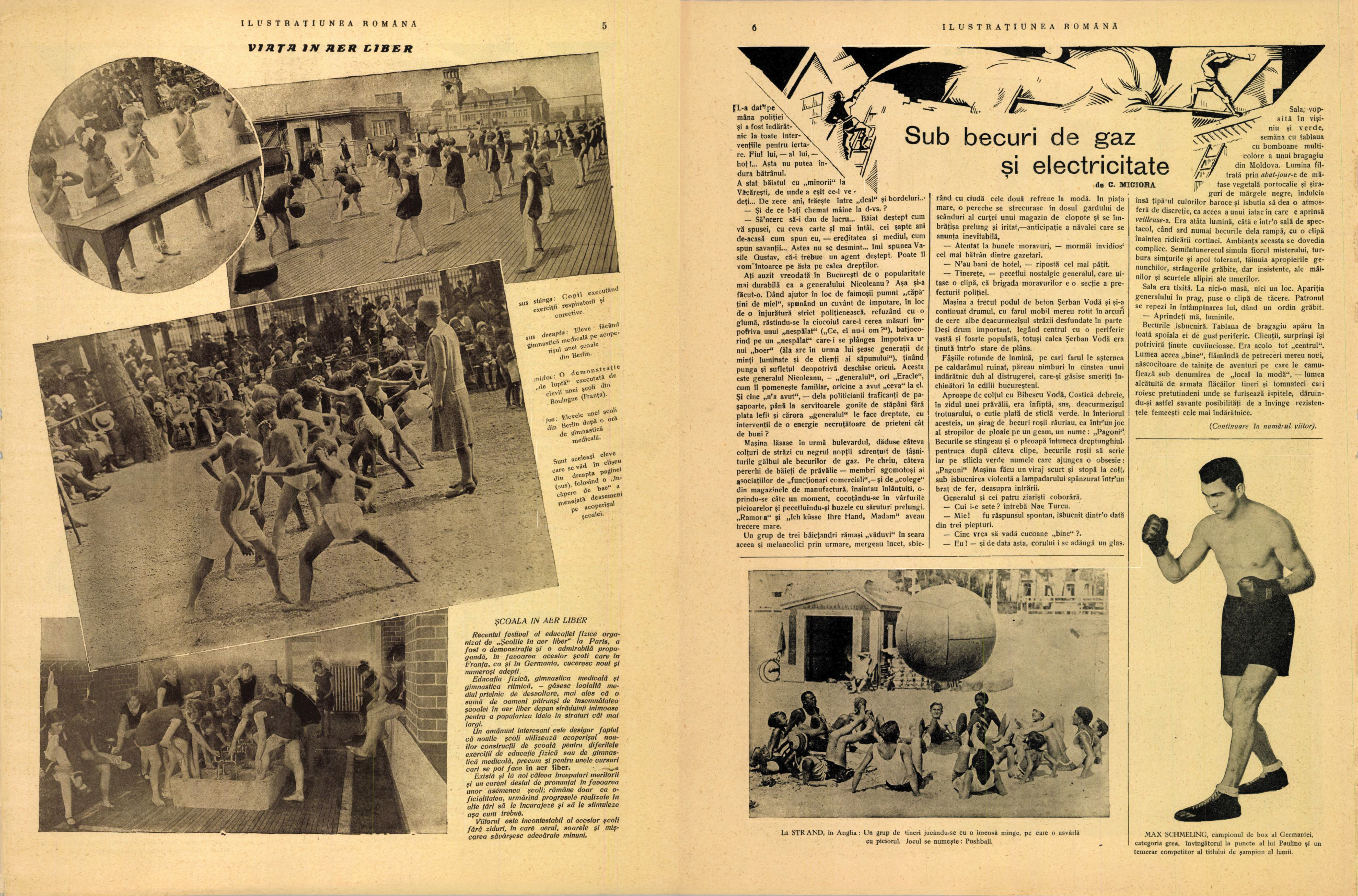
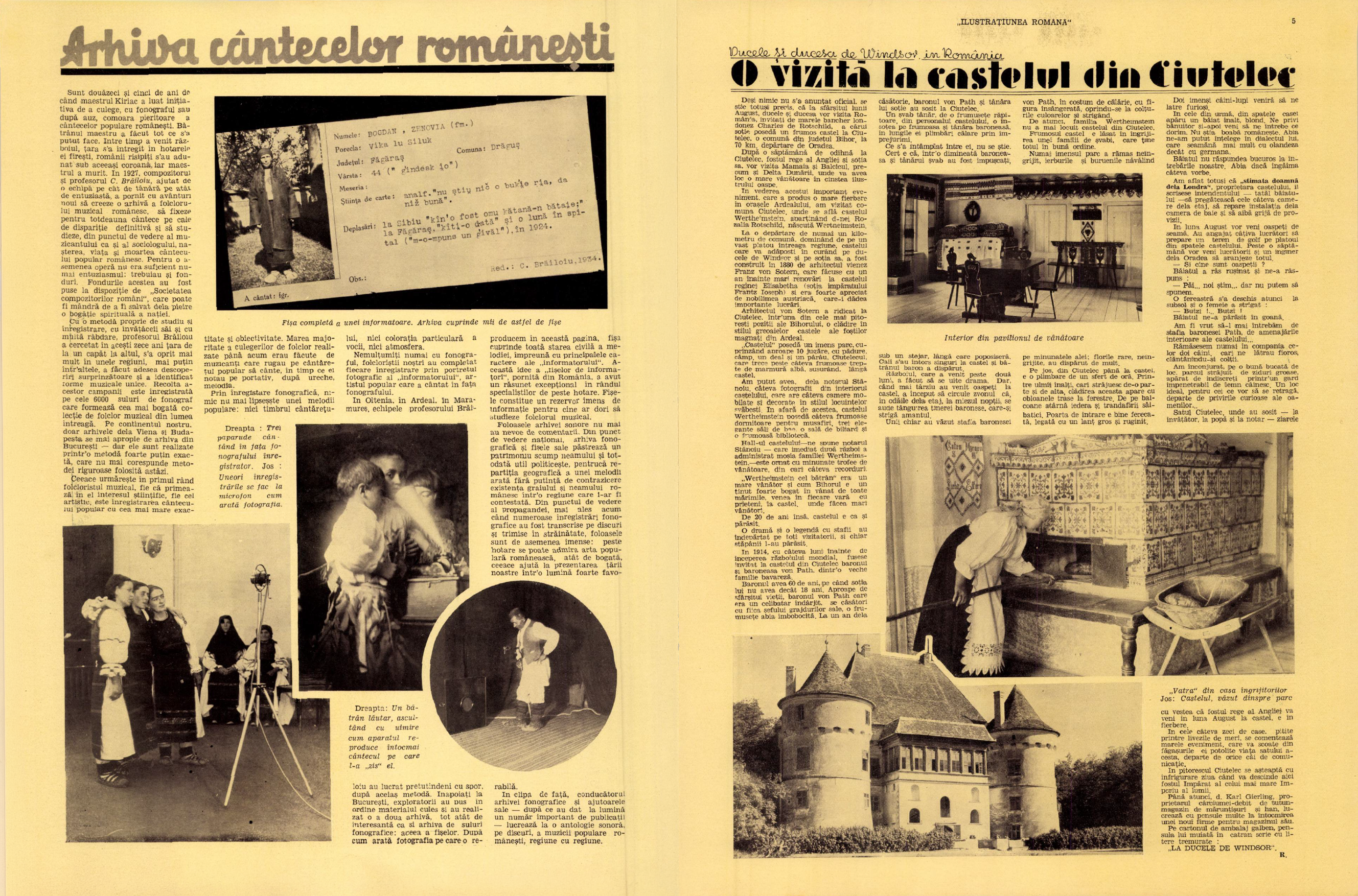
The first publication was aimed at an audience interested in reshaping Romanian society in a romanticised Western image, presenting it as an aspirational future for the country. The design was similar to what you would see produced abroad pre-WWII: playful, with dynamic layouts, covers with bold photography, as well as handcrafted typography revealing a push and pull between tradition and modernity. Just looking outside of Romania, you can see the visible similarities between Ilustrațiunea Română543 and the illustrated magazines from France (L'Illustration542), Germany (Berliner Illustrirte Zeitung544), and Great Britain (The Sphere545).
Despite these modern influences, Romanian folklore still comes through in folk motifs and references to national history, in depictions of traditional costumes, and in portrayals of historical figures.
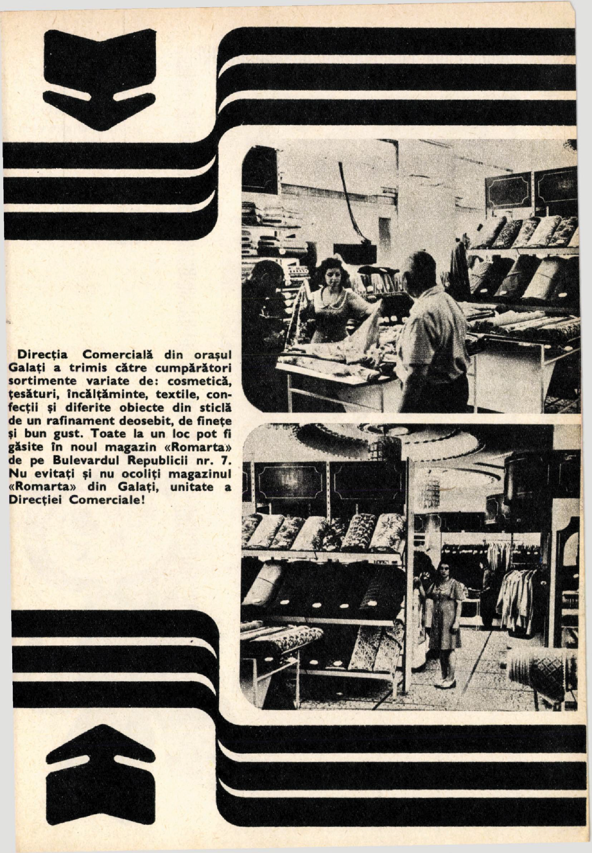
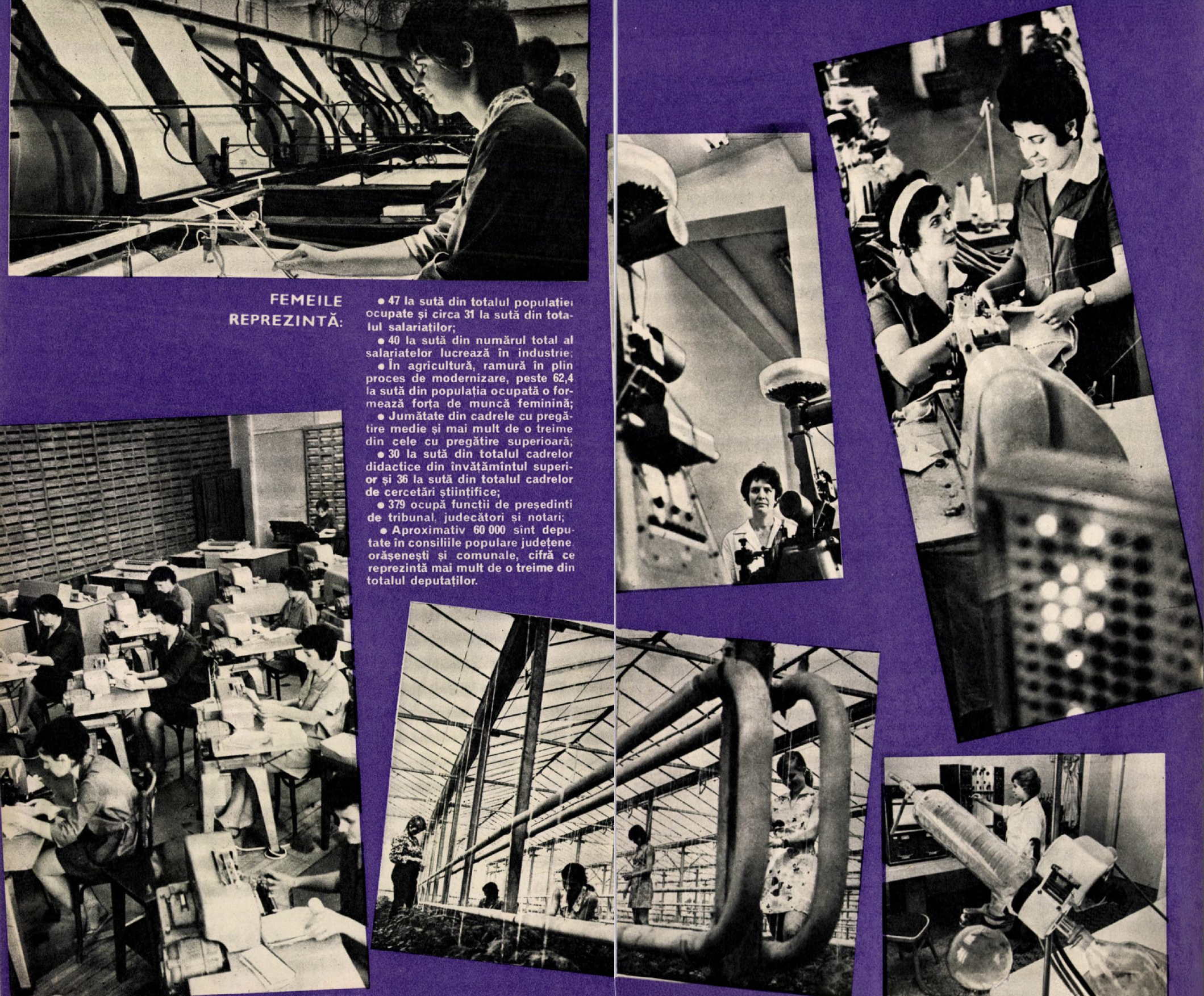
Subsequently, when the communist period began in 1947, the borders closed, the liberal press outlets shut down, and the printing industry was nationalised546. The magazines suffered through the change, existing as a vehicle for political power. During this period, printed culture rarely functioned just as print alone, it was intended to create a persuasive narrative of a heroic communism. Propaganda was not a genre, it was the default setting. It did not show only through text, but through a visual language. Bold colours and repeated graphic elements aimed to capture attention, using decorative borders meant to isolate and offer importance to the articles. Circled or highlighted parts of text moved the reader’s attention to key points, with bold arrows547 and bullet points precisely guiding them so the message was clearly understood.
What distinguishes this from graphic design made primarily to inform or delight is the degree of control it tries to exert over interpretation: instead of offering hierarchy to help the reader navigate, it leaves almost no room for ambiguity, pause, or personal reading. In the context of these magazines as political vehicles, layout becomes less a neutral composition and more a directive tool of persuasion. Even a quick browse through the publications felt exhausting: there was barely any room to breathe, no white space, and information everywhere; most of the time poorly printed or overlapping, prioritising quantity over quality.
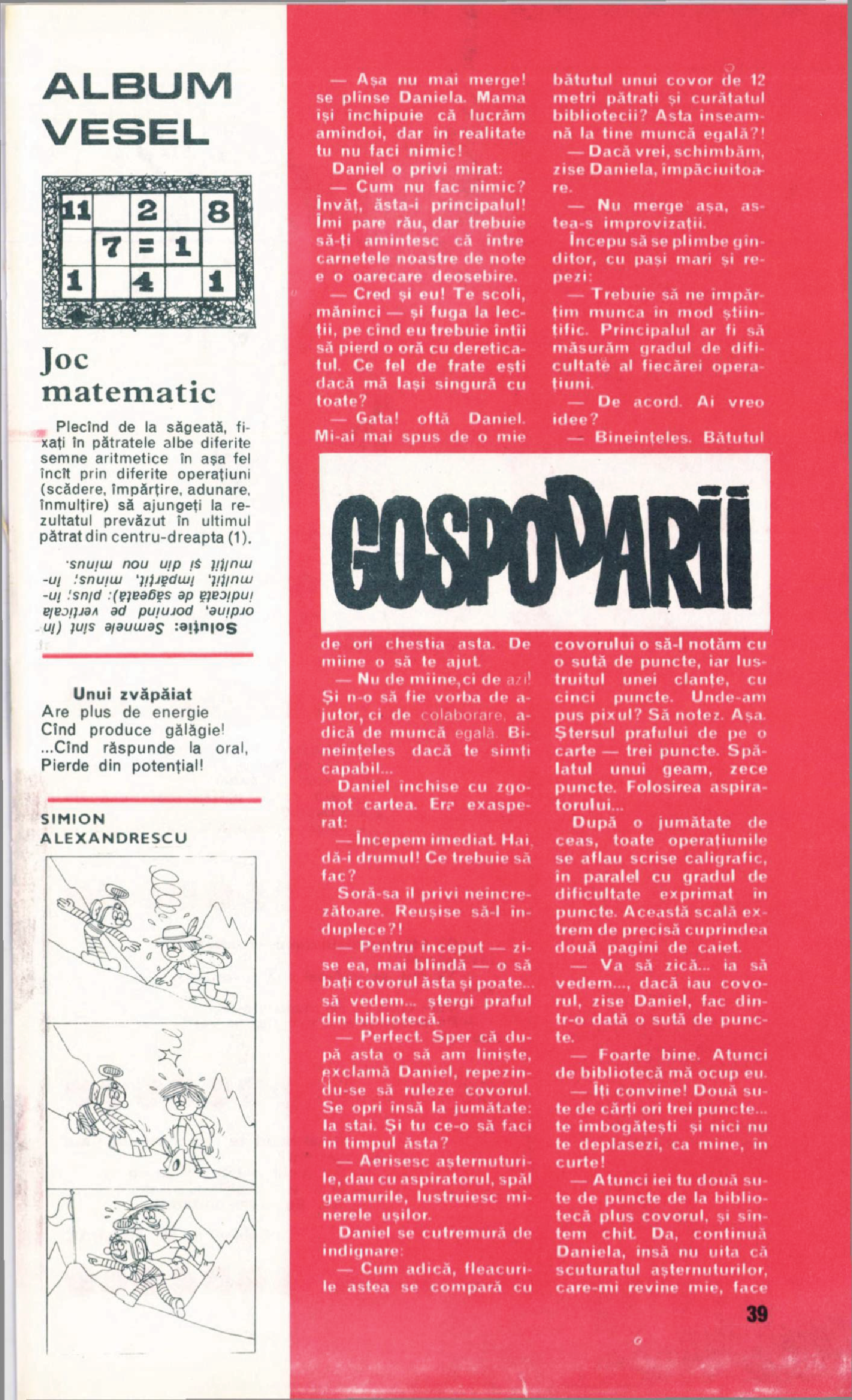
Misprints were common, with text sometimes so misaligned it became nearly illegible, yet the magazines continued to circulate. The absence of space in these magazines was due to the lack of paper, caused by the major changes in Romania due to communist planned economy547. Additionally, there was little importance given to typography, forcing the information to be as condensed as possible. Those imperfections, which hold their own unique beauty, reveal the regime's desperate push to control public discourse through printed media. Moreover, the role of photography and illustration in the editorial context shifted.
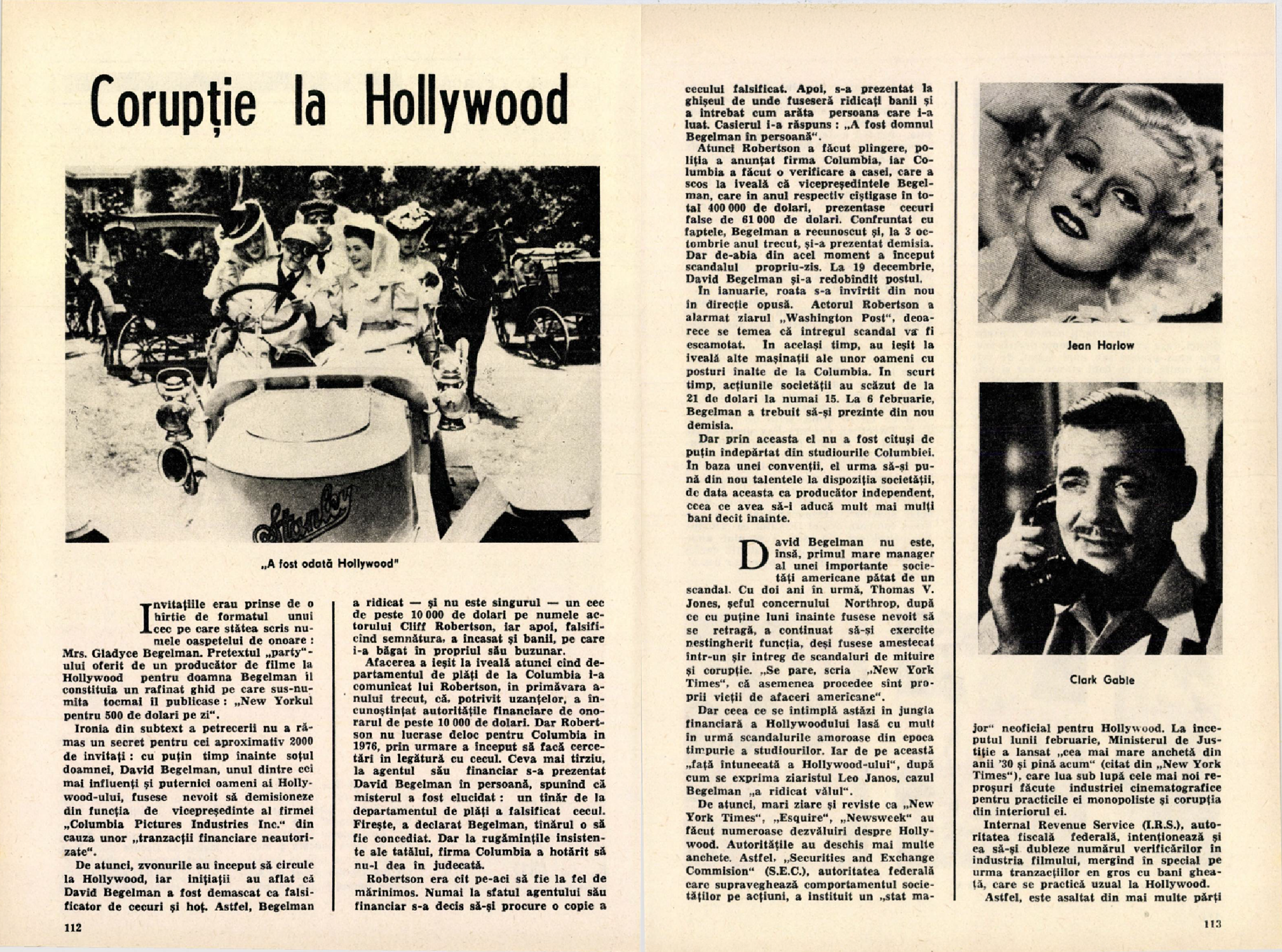
In the pre-communist era, they were used to contextualize a reality distant from Romania, connecting readers to Western culture and modernity548, while during communism they served to construct a utopian vision with pictures depicting content citizens, such as women hugging their children or happy workers. More often, these figures were staged as emblems rather than individuals: children in communist uniforms, and adults posed as model employees.
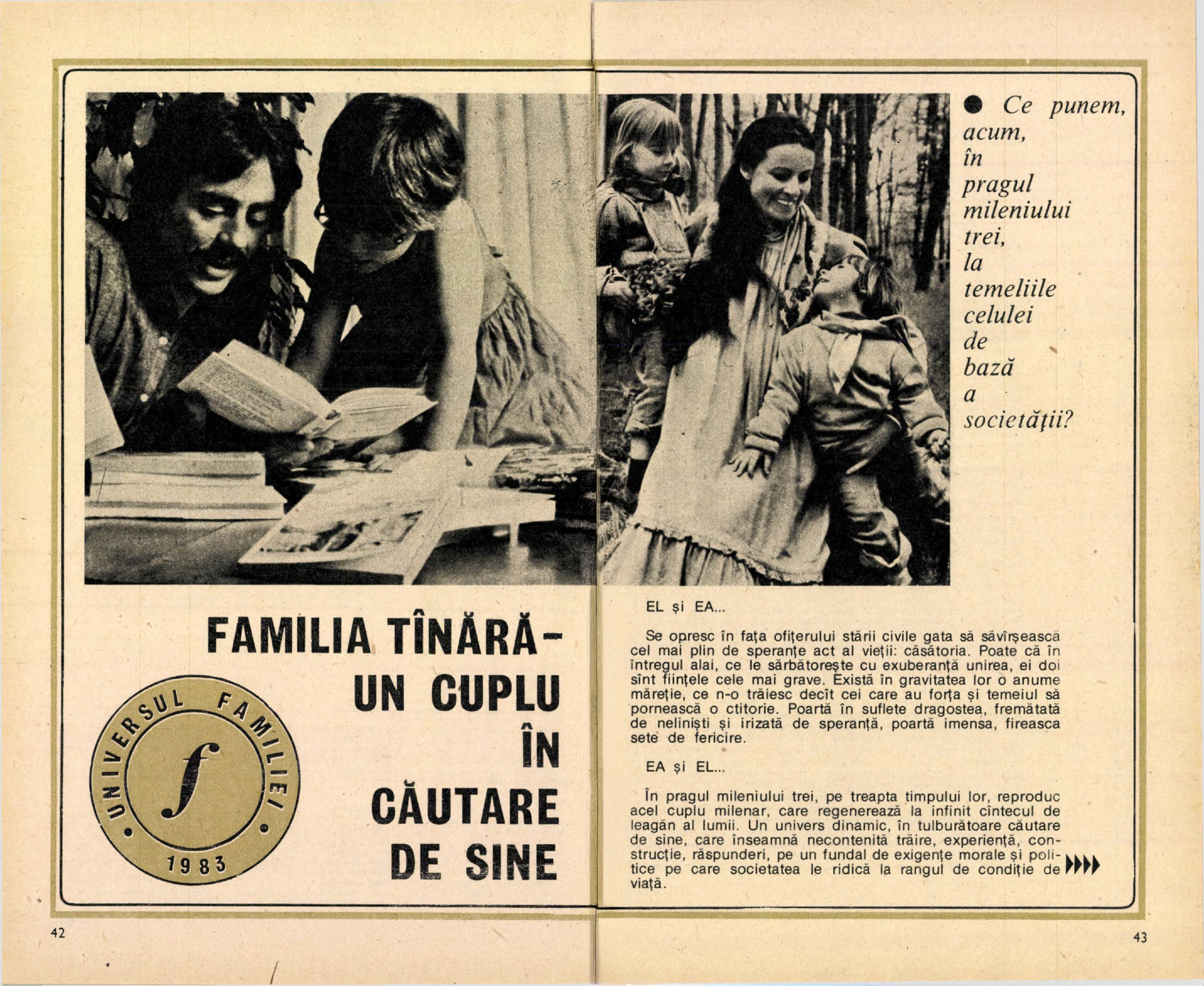
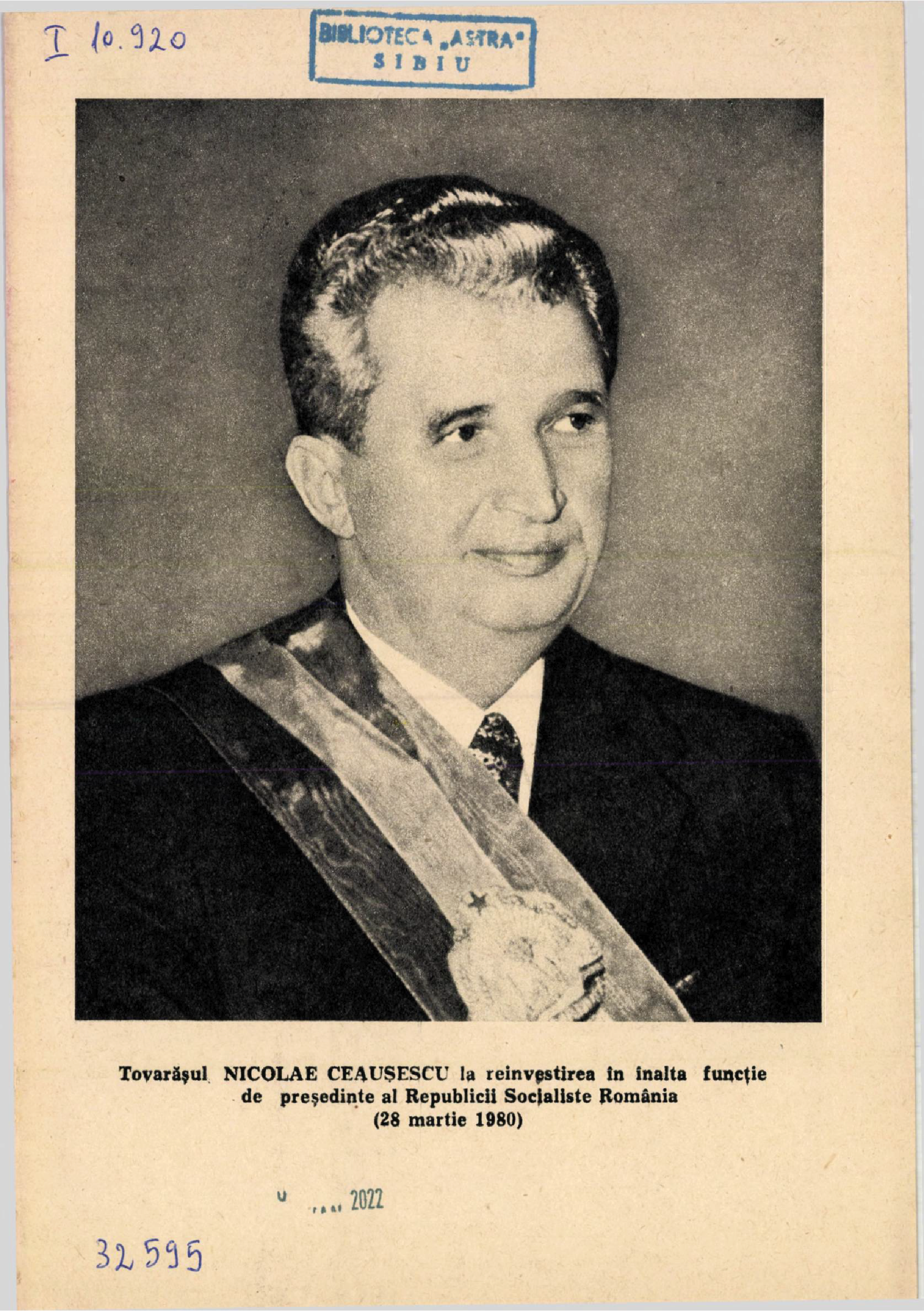
As communism shifted from an early utopian promise into dictatorship, its propaganda became harder to miss, and opening these magazines often meant being greeted by portraits of the dictator, Nicolae Ceaușescu. Typically, these photographs depicted a resolute leader, evoking seriousness and power. Lighting, coloration, and golden framing were employed to underscore his perceived perfection, sometimes depicted as a saint, Nicolae Ceausescu was portrayed as an Orthodox icon.
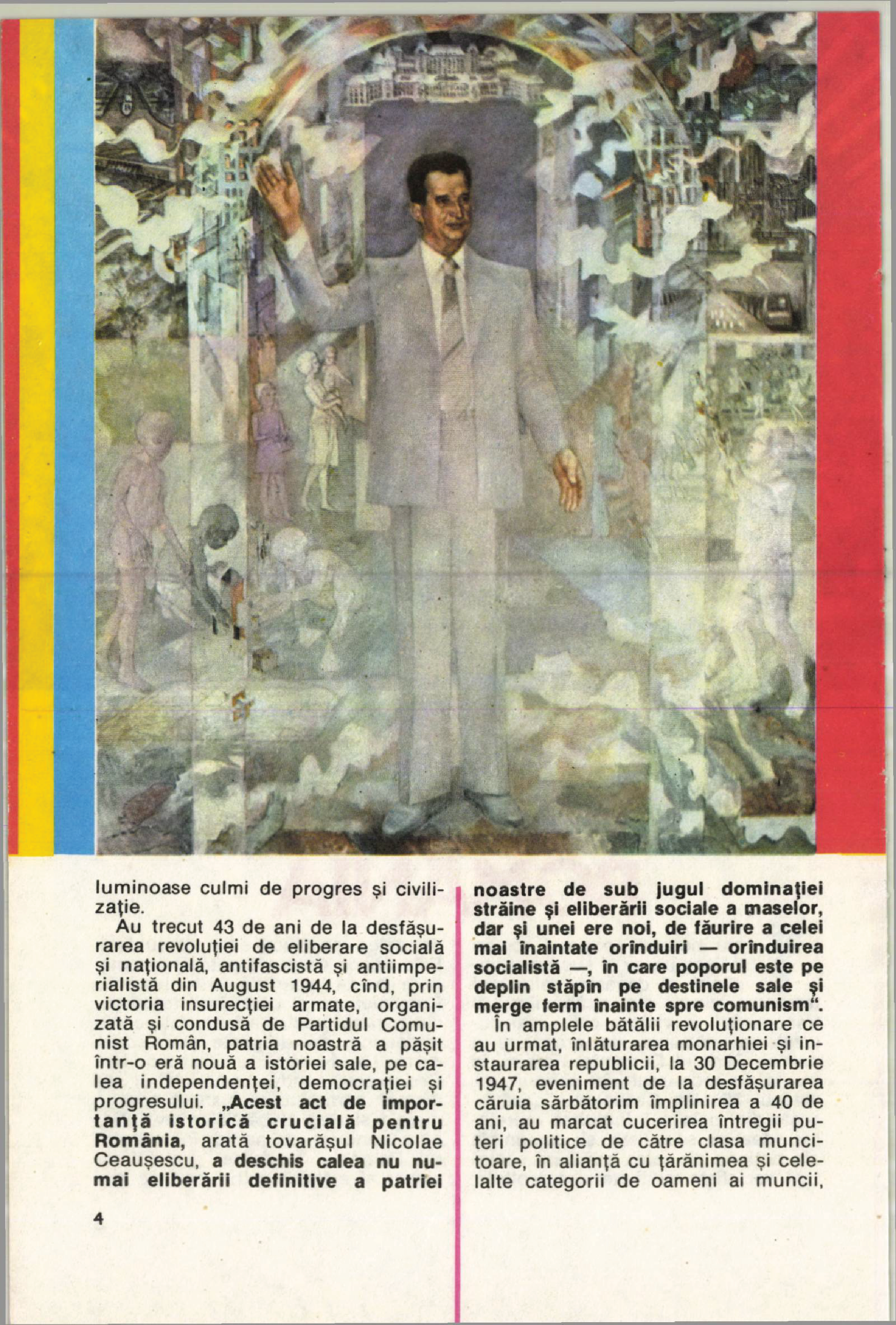
Often, the first pages would open with staged photographs of Ceaușescu and his wife: touring factories, posing with workers, accepting flowers, and frequently appearing alongside children. These scenes presented admiration as ordinary and intimacy as real, manufacturing a comforting closeness to the viewer. In doing so, they aimed to forge an emotional link, compassion, affection, reverence, or fear.549
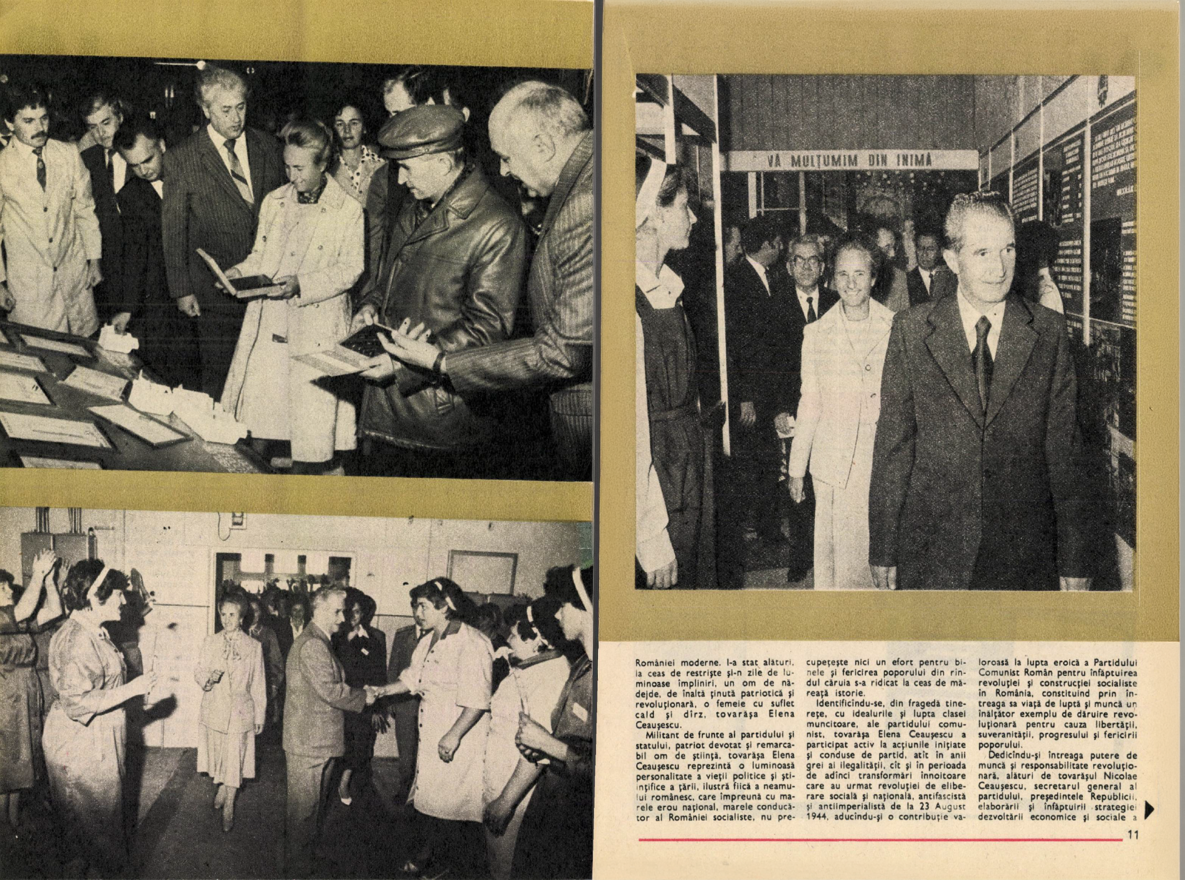
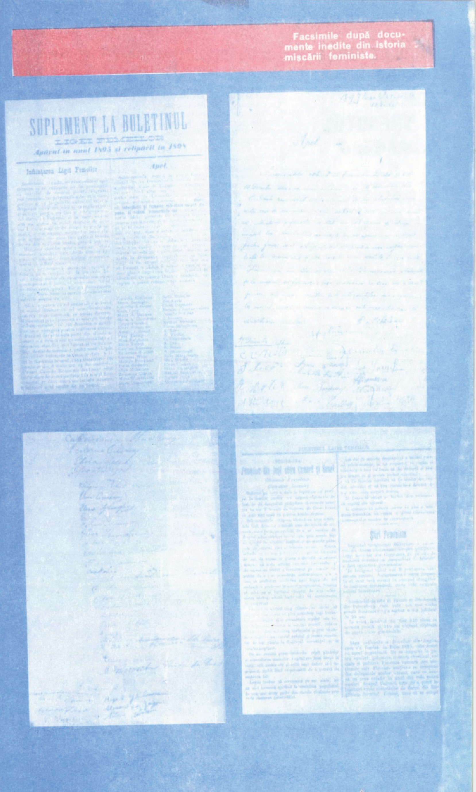
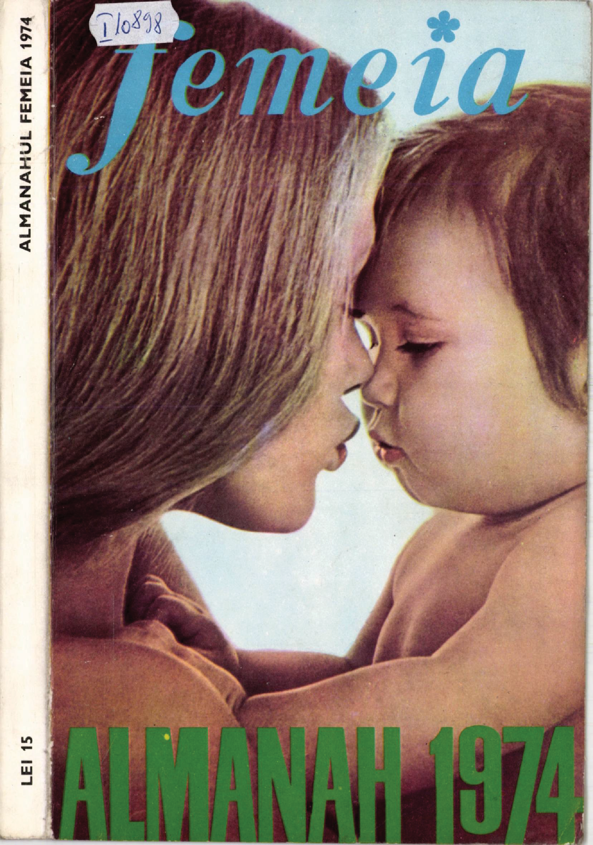
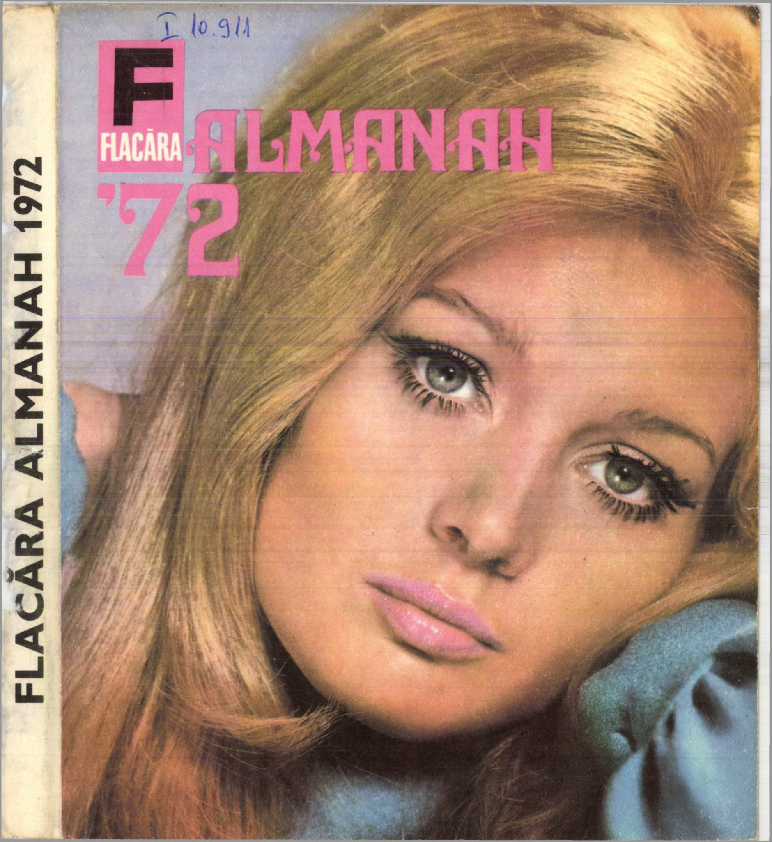
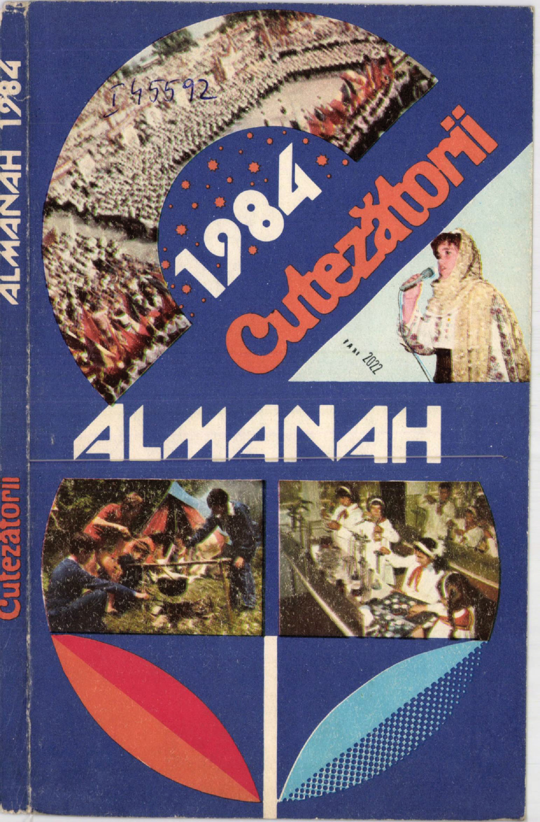
Propaganda was most effective when it did not announce itself. For my grandmother, these magazines arrived as ordinary mail: something delivered by post, to be read and taken for granted rather than questioned, and certainly not analysed as a political instrument intended to manipulate. In the publication Femeia (The Woman)550, she found stories about family life, the latest trends, articles on how to be a good wife, and advertisements. In Cutezătorii (The Brave Ones)551, she encountered lessons and narratives meant to educate children. Flacăra (The Flame)552 was a social and cultural publication, usually including articles, interviews, entertainment news and promoting the arts.
Preceding all this information, Ceaușescu’s portrait on the first page did not disturb or shock my grandmother, it seemed rather normal. Over time, she had been trained not only to accept communist principles, but to love them, and teach them further. The fairytales told by the communist party are in parts my grandma's reality. Not questioning authority and accepting things as they were gave her a sense of stability that she now believes has been lost.
Political influences coupled with technical restrictions forced Romanian graphic design to create its own unique, quite beautiful visual language. The recurrent graphic design elements used throughout these publications became a visual vocabulary. Designer Raymond Bobar describes this as the early creation of a style: “We were on the verge of creating a style… If it had lasted another 10 years, I think we would have reached a good point”.
During our conversation, we agreed that Romanian graphic designers at the beginning of the 20th century produced a lot of high quality work and maybe this was because most designers, at the time, were trained in art school as fine artists. Looking back, it was frustrating to see what we had lost. They took risks and had a strong eye for composition and colour. Their knowledge combined with the medium’s limitations, led to ingenious, unexpected solutions in print. These unknown designers continued to produce, but as time passed the design slowly lost quality.
“After so many years of communism, people get tired,” Raymon Bobar stated, explaining the slow decline. However, the catalyst that caused the loss of both designers and design standards was the aesthetic deindustrialisation of the 1980s: the arrival of computers. Skilled graphic designers were replaced with engineers, who produced faster work and knew how to operate the new technology but had no aesthetic flair.
In the 1990s, Romania reopened its borders, private publishing was revived, and publishers began translating and reproducing Western books. Republishing these books often meant copying their designs without second-guessing them. The consequences were visible: blind copying of Western patterns led to a decline in the quality of the editorial market.
In the absence of an aesthetic authority, poor copies became the norm.
– Raymond Bobar
Maybe the desire to copy the West – again – came naturally, from a need to forget the past and a fear of looking back. Or maybe, as Raymon Bobar says, the decline in graphic design happened because of a lack of encouragement to study design and the arts in general. In Romania, graphic design is an understudied field, and still new for most Romanians despite the traceable heritage in popular media. After all, the word design only entered everyday vocabulary in Romania in 1974. Perhaps, we can associate the absence of knowledge with the short time that this subject has been studied. As time passes, these publications–or pieces of design history– continue to fade from the collective memory.
I am not trying to create a closed definition for Romanian graphic design through my research, but to open a space for others to continue. Instead of an enduring national style, what most characterises the history of our visual language–to me–is its unevenness, its identity shifting in line with our country’s politics. I’m convinced that for this field to grow, we need to research and write more. To create authentically we must understand our heritage and how power shapes visual culture over time.
Whatever the reason, a poor understanding of power will leave an emerging designer unprepared for the complexity of social issues where power has played a key role.553
Discovering the visual language within those publications enabled me to read the push and pull of power in Romanian society, revealing a history that otherwise had not been documented, or tried to be understood. This is an effort not driven by nostalgia, but by a curiosity for a period of time that has been underexamined and overlooked. As such, this essay is an invitation to others to research with me, to enter into this dialogue, to venture into antique bookshops, and to ask your own grandparents to see their collections of magazines.