(9)
Studio portrait of Hanzer Liccini by Simon Hanzer.
(10)
Hanzer Liccinis talk at the Wei sRaum in Innsbruck.
(11)
The ABC Arizona typeface was the first sans-to-serif variable typeface family.

(14)
Johannes Breyer from ABC Dinamo gave a talk at Post Design Festival in Copenhagen in 2019.

(12)
Don’t touch by Yehwan Song
(13)
Willy Fleckhaus, edition suhrkamp, 1963, © Suhrkamp Verlag
(15)
(16)
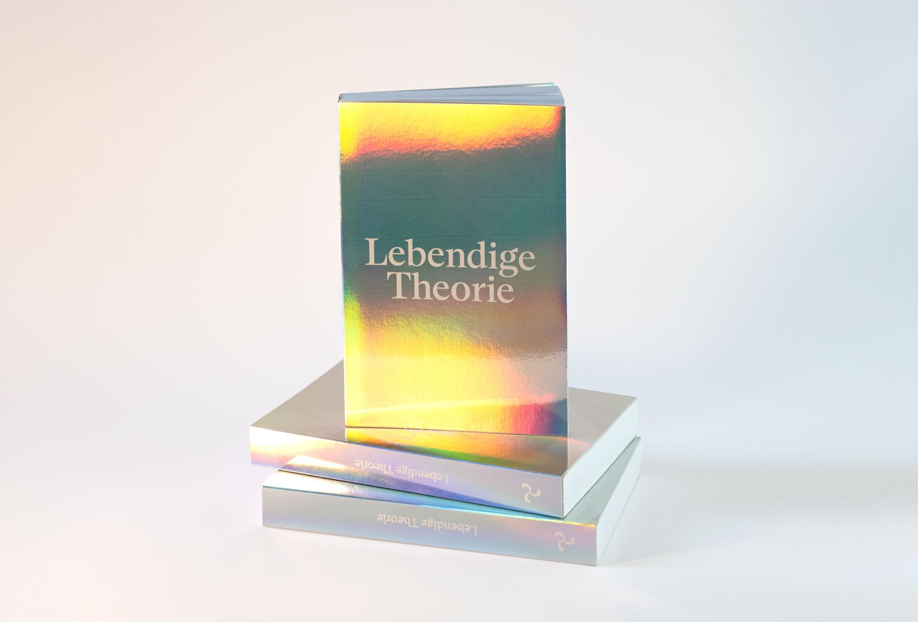
“Lebendige Theorie” designed by Hanzer Liccini and published by Textem is typeset in 16 variants of variable sans-to-serif ABC Arizona.
(17)

On type’s right to be
legible or illegible,
disciplined or quick
Interview with Elias Hanzer
Speaker at chapter 1: Practice
March 2022
After the talk Elias Hanzer gave at the first chapter of the Post Design Tangle in Stockholm in March 2022, we checked in with him for a chat about his practice, design approach and what and who inspires him.
What have you been up to since we saw each other last?
The biggest update is that we (Hanzer Liccini) finally moved into our first studio space. Also we got our teaching and lecturing careers rolling and had a talk at the Wei sRaum in Innsbruck, a work & travel trip to Vienna, a workshop/talk at the Swiss interactive media design day and a two-week Lehrauftrag at Kunsthochschule Weißensee.

Your type design and graphic design work has a very playful feel to it and at the same time there is a sharpness and clarity that seems to come from a certain amount of patience, orderliness and attention to detail in your process. How do you strike the balance between play and discipline when you work?
There is this and that. We always try to work in different ways – there are projects that just need a lot of attention, care and discipline. Other projects really benefit from a quick approach. We both have the ambition to create visually playful work, while simultaneously maintaining a certain sincerity, but also to do something different from the previous project and not to dress up every assignment with the same design or style.

In your approach to type design you seem to be driven by experimentation with the new tools and technology that are available now, like variable font technology, but at the same time your work often references historic typefaces. Where do you source old type specimens, and what usually draws you to a specific sample?
Design and especially typography is always driven by these two factors: The old and the new. On the one side you can’t really re-invent the form of the letters, as their “main” purpose is legibility. The forms itself are only changed within new media and that again means through technology. I think if you are doing design and being aware of that, it is always a good thing to know what you are referencing. We usually source old type specimens from books and libraries or online archives. It is hard to say what exactly drives you towards a certain sample. Sometimes it is an overall feel that a typeface inherits and sometimes it is just a small detail/idea within its forms that could be extended into something else.
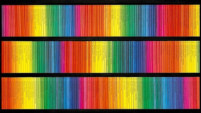
Your book series for Suhrkamp Verlag rests on the shoulders of the colorful modern design Willy Fleckhaus iconically did for Suhrkamp in 1963 and which was in use all the way up until 2004. What considerations did you have when designing the series in terms of being aware of that lineage while also designing for the present time for example by taking advantage of the possibilities that come with variable fonts?
We wanted the design to subtly reference the typographic simplicity and the rainbow-colour concept, that Willy Fleckhaus based his design on in the 60s. We designed each book with three colours. One color on the front, back and spine of the cover. The second one on the top and bottom paper edge and the third one on the fore edge. For each book we used colours that are tri-complementary to each other, resulting in a vibrant spectrum of colours for each title. For the design, we used the sans-to-serif typeface ABC Arizona, which I released with Dinamo in early 2021. It was important for us to use a typographic system, that can react to the very different kinds of artistic texts by the various authors of Suhrkamp Theater Verlag.

During her talk, creative coder and digital designer Yehwan Song presented her ideas about anti user-friendliness on the web, challenging the perceived necessity to create “smooth” UI experiences. The discussion around user-friendliness in interactive design seems related to that of legibility vs visual expression in type design and graphic design – a discussion that can perhaps be said to have been ongoing since “the head of the ox”. An often-cited principle is “good typography is invisible” speaking for legibility as the foremost function of typography. In 2003 David Carson famously said that: “Just because something is legible doesn’t mean it communicates and, more importantly, doesn’t mean it communicates the right thing.”. In some of your type design work you seem to be concerned with visual attraction, expression or experimentation over legibility too. What is your take on legibility in type design?
It definitely depends on its application. I believe type has the right to be legible and illegible without any intention to value one more than the other. In the end type is just an image which we have collectively learned to decode linearly and not every image must to be perceived pictogram-esque as quickly as possible. If the expression of a typeface is more important to the message than its actual meaning, you can just cut off a slice of its legibility!
Your time as an intern and later as a collaborator of ABC Dinamo seems to have been impactful and important in your process towards creating your own independent practice and studio with Lucas Liccini. What do you take with you from your experiences with Dinamo and what have you learned that you couldn’t have learned in school?
I learned a lot during my time with Dinamo, which is still ongoing. It sounds a bit like a love letter… but Dinamo follows a certain humbleness, non-didactic approach and simplicity that always has inspired me greatly. Working so close together with Lucas – I indirectly learned a lot from his experiences with Fraser Muggeridge, Quentin Walesch and Manuel Raeder as well. But in a sense all of these references are scholastic, as all personal connections and experiences I made through the years are closely linked to my years at UdK Berlin.
Which part of your practice is the most important to you?
Maintaining a healthy balance between managing increased email traffic/calendar entries/deadlines and finding the calm moments for extensive visual research.
Back to grid

